UC’s Office of the President (UCOP) provides prospective UC students with application and admission resources in one place. UCOP needed a new website that not only made the applications and admission information more usable but also provided the unified brand proposition for the entirety of the University of California which is 9 campuses strong.
From exploring campus options and calculating financial aid, to authoring tips for the application itself, students can rely on the admissions site for providing clear guidance on preparing for and applying to UC. Over 200,000 students apply to UC annually using the admissions website. (In the last year, the admissions site had 3.8 million users and 17 million page views.) This makes it the single most viewed site that presents a cohesive view of the mission and purpose of the whole of the University of California.

OUR WORK | Workforce Transformation
Uniting Icons of Education

- Increase Efficiency
- University of California Admissions
- The Ask
- Ease user journey
Increase Efficiency
Highlights:
- Brand Positioning
- Content Strategy
- Visual Motifs
- Creative Brief
- Modular Design
- Increase Efficiency
- University of California Admissions
- The Challenge
- Serving dual needs and multiple audiences
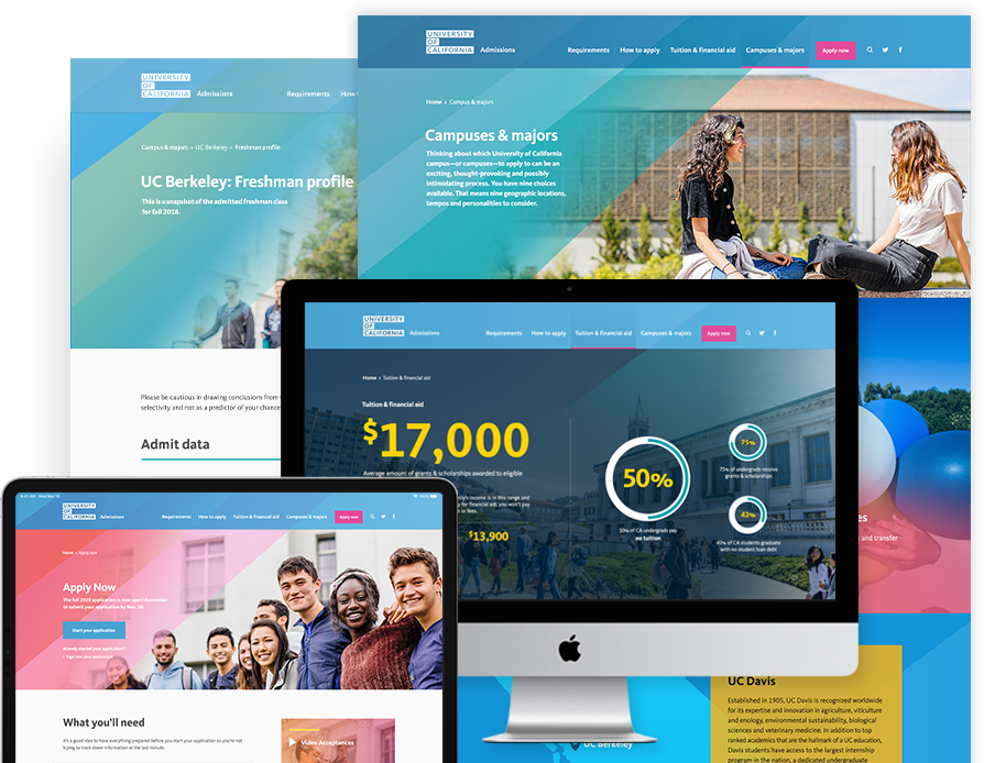
Redesign the current iteration of the site which was nearly a decade old. Areas in need of immediate improvement included: Updating the site to be responsive and mobile friendly, ensuring the site meets accessibility standards and refreshing the design. Bring the UC brand to life through the design and ensure that it appeals to students from all backgrounds, ethnicities and incomes. UC attracts the best and brightest. UC undergraduates come from all over California, and they work hard to make it to college. In fact, over 40 percent of UC students come from low-income families. UC as a system needs to come across as accessible from a financial perspective while showcasing its educational eliteness. Although prospective students (high school students and community college students) are the primary users for the site, the site serves many other (secondary) audiences, such as college counselors, parents/families, and UC’s campuses, who also depend on UCOP’s admissions site as a definitive, centralized resource for admissions criteria, and application and financial aid information.
- Increase Efficiency
- University of California Admissions
- The Results
- User Friendly and Brand Forward
applications annually
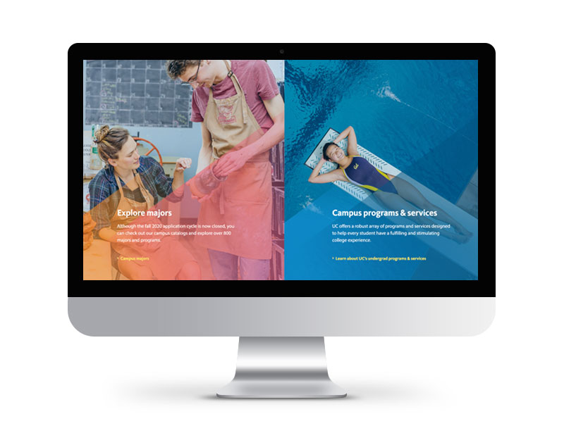
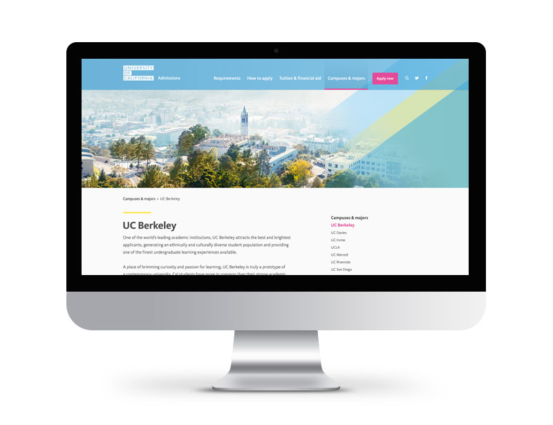
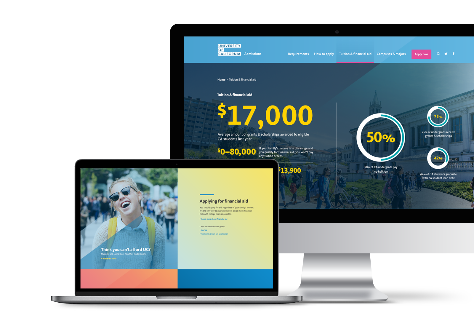
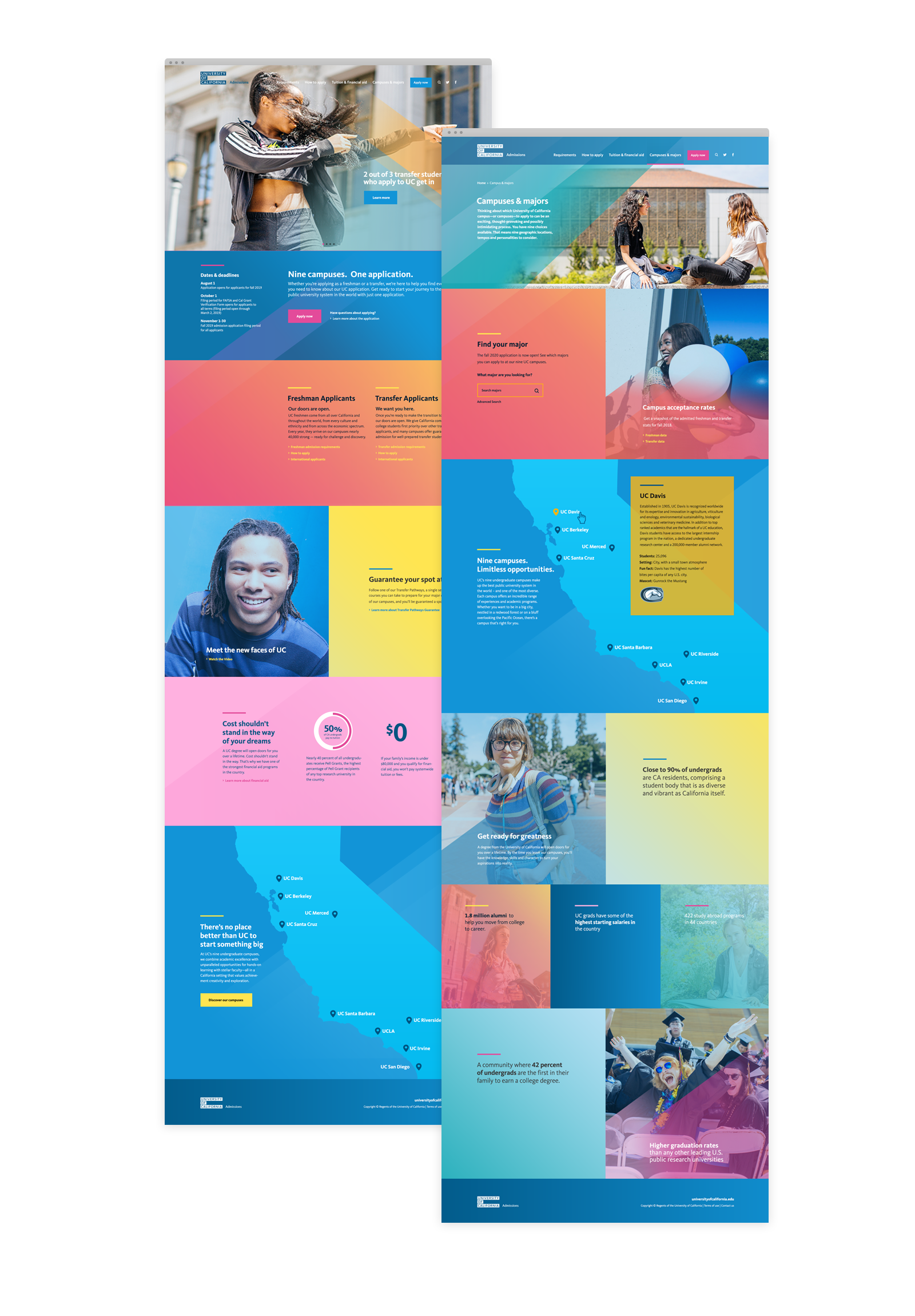
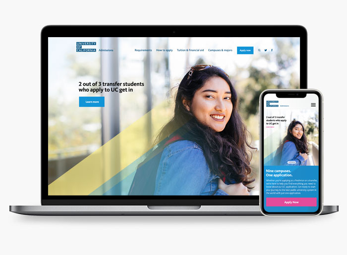
Our design allows UC to tell its brand story (being of, for and by California) and highlights the essential nature of UC in an organic way as users navigate to their essential admissions forms and information. The responsive modern experience is ADA compliant. The site experience is warm and welcoming to all students. It’s both a site that focuses on user needs and utility while bringing the values of the UC to life.
The newly re-imagined UC Admissions site launched in August 2019 and the response has been overwhelmingly positive across the board, plaudits have poured in from up and down the organization.
