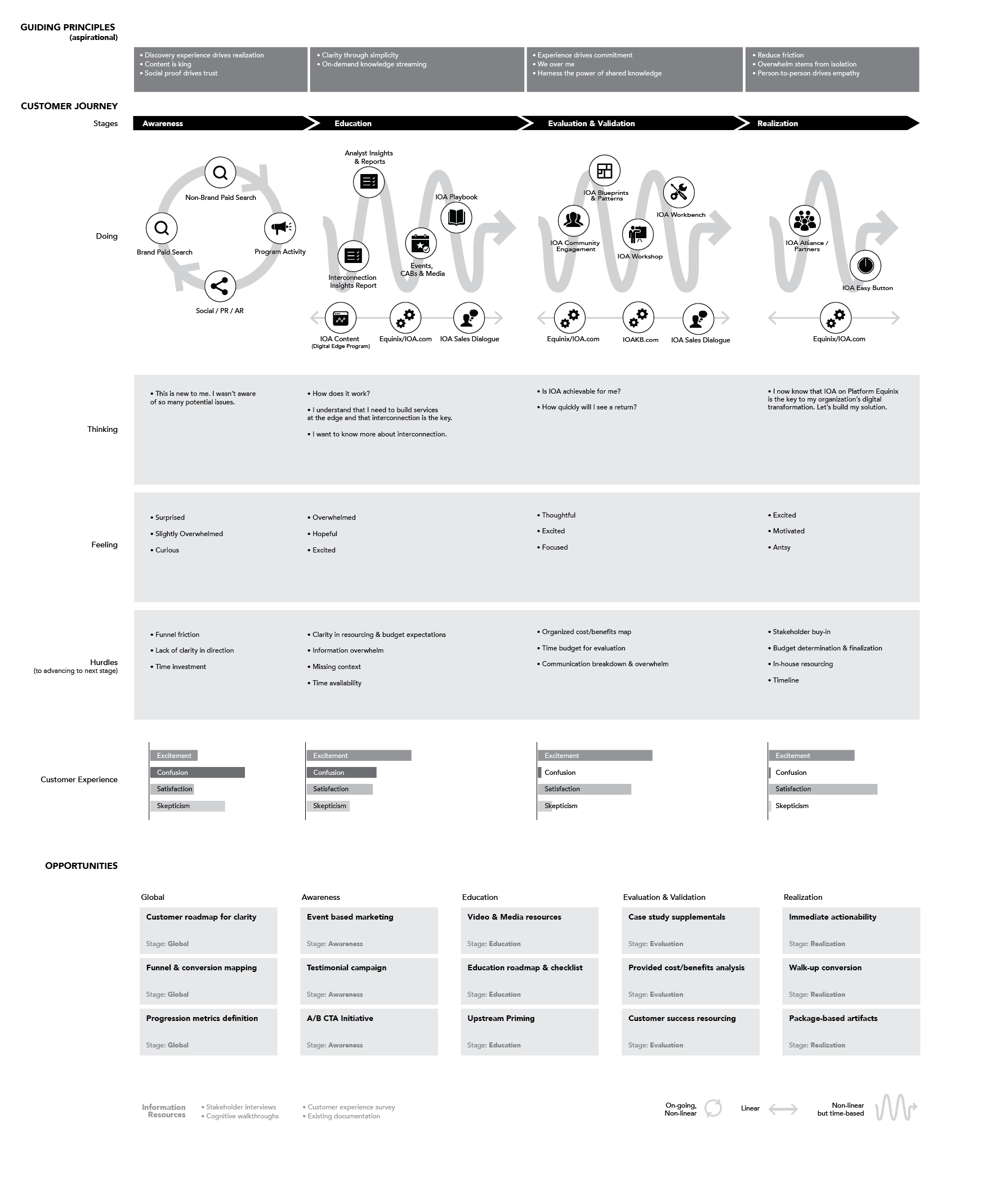
When’s the last time you left a doctor’s appointment, saying, “hey, that was an incredible experience?” While it may not be the standard -- yet -- it’s starting to happen more and more.
Between concierge services like OneMedical, entirely re-envisioned preventive care like Forward, or even supplemental services such as SafeRide’s medical transportation platform, digital is unlocking better experiences across the healthcare journey. The common thread we see is a fierce commitment to removing friction, frustration, and pain from the patient experience in an effort to cut through to providing value.
With this rise of digital healthcare and its promises of efficiency, convenience, cost savings, and 🤞 healthier people, here are our top ten UX considerations that we’re tracking for creating outstanding experiences.
1. Patient-centered UX -- Start with Empathy in the Patient Journey
The most important consideration is meeting patients where they are. Healthcare journeys are often complex and personal. They are made up of multiple touch points, across days, months or even years. People’s emotions can bounce between frustration, anxiety, fear, satisfaction, and more all along the way.
Winning organizations recognize this and work to understand the wide variety of needs, feelings, and expectations of a patient at each step of their journey. Before ever getting to pixels and code, start with humans. Emotions, beliefs, and actions are the key to unlocking real potential in innovation, and helpful healthcare digital experiences. Generative research such as interviews, diary studies or even surveys will uncover insights around all of those and be the best soil in which to grow an experience that’s truly helpful.
After insights are gathered, sort, bucket, organize, or [insert your favorite verb here] them into a map of the patient journey. To provide real value, this layer cake of empathy can then be used to ideate valuable opportunities against. This will generate a rough roadmap of options for which to design, build, .test and learn from.
With opportunities in hand, we recommend fast and energetic iterations using design sprints to get ideas off the whiteboard and into users hands as fast as possible. Seeing how people interact with a potential solution is the fastest way to validate an idea. And since it’s hard to move fast and break things in healthcare (because it could be a matter of life or death) having a way to test and validate an idea before it goes to the masses will help reduce risk and increase success.
Making winning user experiences in digital healthcare aren’t as easy as following a recipe of ingredients, but it’s also not hard. It takes empathy and a process that puts your patients at the center of everything you do.
2. Utility - Patients Want to Get Things Done
It’s fair to say a lot of patients are short on time. Digital has opened a new door on saving people time and energy by being the front door of services. Booking airfare, hotel rooms, depositing checks, even having groceries delivered through apps and websites has become so commonplace that is the norm not the exception. This is utility and users expect it. So when users come to your experiences, if they don’t have a way to self-serve and get things done, they’re probably going to move on to somewhere where they can.
That’s why we consider the principle of utility to be one of the top considerations in designing UX for digital healthcare. Do what it takes to let users take control and get value as early and often as possible. Design, build, leverage existing 3rd party tools and tie systems together so that users can book their own appointments, communicate with their care team directly, take preventative health measures, and even get treatment. Your users will thank you -- by remaining your users (and not going somewhere else to get it faster, cheaper, better).
3. Privacy & Security
Privacy and security is an important concern in digital experiences across any industry. According to a Price Waterhouse Cooper 2017 survey only 25% of consumers surveyed believe most companies handle their sensitive personal data responsibly but 85% of them say cyber security and privacy risks are among the biggest risks facing society. So, consumers are aware of the importance of privacy and security of their data and feel that companies don’t necessarily handle it responsibly. This adds up to 85% of consumers saying that they will not do business with a company if they have concerns about its security practices.
Healthcare is a highly regulated field and with that comes the HIPAA privacy and security standards that organizations experiences must abide by. But just because a health organization may know them inside and out (right??), it doesn’t mean that patients do.
As you design your user experiences, look for opportunities to reinforce the concepts of privacy and security through both features and content. Two-factor authentication, salting passwords, and military-grade encryption may work well, but if a user is unaware of what's going on in the background, then there’s missed opportunity to reinforce trust in privacy and security.
On the other side, considering the unique journeys patient to patient, there are needs for patients to share access between other trusted people like family members and caregivers. Great user experience around privacy and security is more than keeping the wrong people out, it’s also about letting in the right people. Make sure to consider your users’ needs on both sides of this coin.
4. Transparency
In this opinion editorial from Modern Healthcare, Joseph Fifer nails it. “Here is the bottom line: Consumers want to know their out-of-pocket prices and other care purchasers want to know what their actual payment will be for services provided to their employees, members, or customers.”
Use your user experiences to push for transparency on behalf of your users. Whether this is related to time, money, or expectations, users will appreciate your effort to be upfront and clear with them.
Examples of areas to consider transparency:
• Pricing -- make costs available upfront taking insurance information into account. Think of ecommerce or shopping experiences as a model to make you experience clear and easy.
• Insurance -- insurance often becomes a black hole with a lot of complicated language. Be upfront about insurance acceptance, it’s impact on the experience, and simplify the language for users so it’s easy to understand.
• Timing -- consider how up to date notifications on timing changes or delays can be worked into your experience. If you don’t want your users to be late, they don’t want you to be late either. Use digital experiences to coordinate and update on timing so everyone’s on the same page.
• Expectations -- Digital is a great means to set expectations. Notify users at the right time in their journey of what to bring with them, or what to expect during appointments. Let them know what the next steps are and even let them track their progress along the way. Systems of notifications, tracking, and feedback are excellent ways to manage expectations transparently.
Every digital session is a conversation between you and your users. You’d want someone to be straight with you in a conversation to your face, so be straight and transparent with your users.
5. Personalization
We’ve already mentioned how personal every patient’s journey is. So it should be no surprise that considering how to make room for personalization in their digital experience makes our list.
Personalization considers information about a user like their previous actions or profile data to help improve their experience. Our view of personalization in digital healthcare is that it should be in the service of promoting healthier, happier individuals -- not just advertising services.
For personalization consider how details about the user like their current state in their patient journey, geography, age, conditions, timing, weather, etc. (just make sure it’s all HIPAA compliant) could impact or improve their ideal experience.
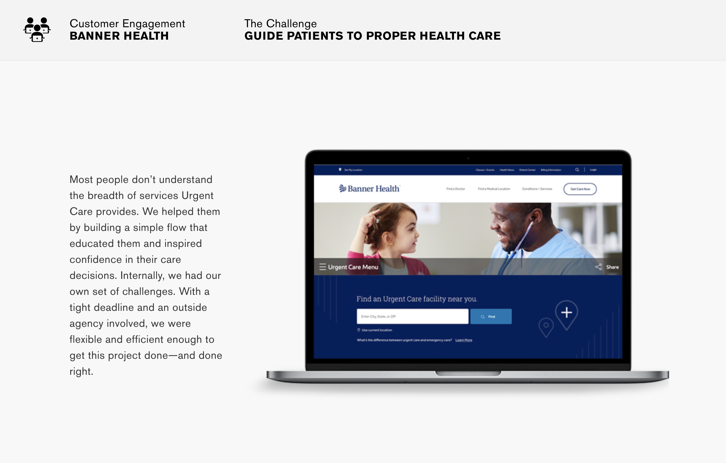
For instance, this Banner Health tool for getting urgent care was designed to use a user’s current location to understand what time it is for them so that it can determine what types of search results to surface based on locations’ hours of operation. It’s subtle personalized content, that shifts a user’s actual experience and decision making.
Personalization doesn’t always have to take place in the background either. Giving users features so that they can tweak or customize their experience to their needs is another form of personalization. An example is Apple’s health app, which lets a user select the types of activities & metrics that are important to them to monitor on a dashboard. This cuts through the noise, and helps deliver a personal experience that provides value to the user.
6. Human (vs.) and AI
What’s a tech top 10 list in 2019 without the mention of AI? Our take on it though, is to focus on how it can integrate in the user experience to augment and help without detracting from empathic, human-based healthcare. To us, an ideal experience blends in AI at the right points to reduce friction, increase efficiency and increase accuracy, while still providing a warm, compassionate human-based care.
Chatbots in digital spaces can create human-like discussions upfront, which can help patients get to the right type of human-based care faster. Full AI adoption is projected to raise the productivity of registered nurses by 40 to 50% which could represent tremendous savings for hospitals in developed countries. AI can decrease the amount of time spent scheduling appointments or even reminding a patient to take their pills.
AI-powered automation allows for the automation of routine activities that often hamper doctors and nurses from focusing their attention on the patient in the moment. Chatbots integrated with deep learning algorithms could be implemented in waiting rooms to handle the large numbers of walk-in patients that come in with non-emergencies. This increased level of organization would allow hospitals to optimize staff while significantly reducing patient waiting time.
Look for opportunities to augment UX with AI in service of patients getting the best care possible, but ensure empathy and human relationships remain central.
7. Accessibility Standards
From our perspective (and the perspective of any good ux and interaction design organization), accessibility should be a consideration in all UX design. That being said, the universal importance of healthcare to everyone means accessibility is more than just a consideration, it’s a hard requirement.
To truly take a patient-centered approach to UX, we recommend starting with shifting attitudes towards the idea that accessibility is the responsibility of the designer of an experience, not the responsibility of the user of the experience. The social model of disability emphasizes that it’s not a person’s condition that’s the cause of limited access to a solution or experience. Instead it’s society’s lack of empathy and inclusion in the design of the system that leads to limited access. As an organization offering an experience, it’s your responsibility to make sure your users can access it fully and inclusively.
The World Wide Web Consortium (W3C) provides standards and guidelines to help ensure content and feature experiences are accessible. Their Web Content Accessibility Guidelines (WCAG) provide a series of success criteria defined to help test your user experience against to assess whether it’s accessible. Designing against these standards is a solid baseline.
We also like Ruby Zheng’s recommendation in her article for the Interaction Design Foundation to assign conditions or disabilities to your personas so that as you design you’re always considering accessibility needs.
8. Language - Reduce the Jargon
Technically this section is an expansion on the concept of accessibility, but considering how common it is to encounter hard to understand, medical or technical language in digital healthcare experiences, we wanted to call extra attention to it. Section 3.1 of the WCAG gives us criteria to ensure an experience is understandable and readable.
It includes:
• Programmatically determining the language of the page and its parts.
• Giving users a way to define unusual words like medical definitions.
• Presenting content in a lower secondary reading level, or presenting companion content for higher reading level content to make it accessible at a lower reading level.
• Providing pronunciation where its needed for context.
We like to approach solving for this by saying things simply and plainly, with minimal use of the big scienc-y words. Explain things to a user in plain language wherever possible. For example, using “heart” instead of “cardiac” where possible. Remember that we’re meeting users where they are, which means we want to talk to them in ways that allow for understanding without a medical degree.
9. Don’t Forget About Wellness
As designers it’s easy to fall into the trap of designing to solve an explicit problem. When a user has symptoms that require medical attention, get them to the doctor. When a user has an outstanding balance, give them the ability to pay. But at the same time, digital healthcare can be as much about preserving a current state as it can about fixing a current state.
Maintaining wellness or preventing dis-ease are examples of users not yet encountering a problem. In these situations the “problem” hasn’t happened yet, but we can design to prevent it from happening where possible.
Here, meeting users who don’t have problems where they are, and understanding how to help them maintain or prevent is the basis for empathy. Once you understand where there are opportunities for you to help them, you can find ways to bring experiences to life that encourage and motivate them to stay the course.
For instance, consider how gamification can be used to encourage users to take preventative measures that will protect them down the road. We love Yu-kai Chou’s framework for gamification, Octalysis. It maps different understandings of human motivation and provides a series of mechanics for how to leverage those motivations to help them achieve a desired outcome. An example of this out in the wild is Fitbit’s achievement badges -- they use an understanding of a user’s “accomplishment motivation” to give users rewards for accomplishing goals.
10. Integrate
Last but not least in our top 10 considerations for digital healthcare we want to highlight the concept of integrations. What do we mean by this? Don’t reinvent the wheel. Understand your user’s current digital ecosystem and work to blend yourselves into it, helpfully. Don’t expect users to switch to an experience you create from one they are already using, just because you build it. For instance, if users are already using SMS, do you need to build a separate app just to chat and notify them about their appointments?
Often times we see teams lured by the deceptive ease of custom building “the perfect experience” including features or functionality that might already exist. It’s easy to underestimate the overhead in building something from the ground up. This leads to design teams over-designing only to find out that IT or development can’t (or won’t handle the lift). Or, we see development teams start an undertaking that leads to long timelines or delays before delivering anything of value to users.
As an organization, look for opportunities on the user side to leverage current experiences and accounts like calendars, email, chat apps, and connected devices that users are already using. This can actually lead to users using your experience more, because it conveniently fits into their digital life.
On the organization side, look for opportunities to integrate different systems together to provide better context and more functionality for users. For example, if you have a billing system separate from your patient portal, look for ways to combine the two in an experience that gives users one place to go to manage their relationship with you. Bonus points for getting your appointment booking in there too 😉.
It might sound hard or even impossible, but striving for a single sign-on and one place for a user to manage their health care digitally with you can build long term brand affinity. And, you don’t have to do it all at once. Build a roadmap, and take on challenges incrementally in a priority order that helps your users most, first.
Conclusion
With an unyielding commitment to meeting your users where they are, and empathizing with them, you’ll have an ongoing basis to always design and develop new value that only you can provide. We’re excited about the future of digital healthcare. There’s so much potential for digital experiences to help users become happier and healthier. We hope that this list can help spark direction and motivation in your digital healthcare experiences. Of course, if you ever need or want help, we’d be happy to meet your users where they are, and bring new digital possibilities to life.
Propane, Digital Agency - San Francisco
170 Capp Street, 3a
San Francisco, CA - 94110
415 550 8692